A book I have had for a while is
"Japanese Graphics Now" by Julius Wiedemann. I often go back to this book for research and inspiration when I start a new project, but as I haven't looked in it for a while I have felt like I have rediscovered some of the work in it!
The image below relates particularly well to my design practice, as it is a papercut book section and it also relates to my chosen theme of structures. I would like to create this 3D structure type element within some of my designs, even if the designs I produce end up being a 2D representation.

The design below interested me in relation to structures as the geometric elements in the design relate to book design and layout & grids that are used to help with layout in books. I think the Japanese text adds an extra element of structure as it is quite formal looking, with geometric elements.

I think the image below is interesting as the structure of the bug is made up of lots of smaller elements (circles) and I like the way the individual elements are contained within its main outline.

I thought the image below was quite an interesting way to represent structures as it could be interpreted as a vertical structure or a structure from a birds eye view (which it is) I think this kind of floor plan image creates an interesting visual that would look good as a papercut, with all the sections connecting to create a larger image.

This image was chosen due to its layout. This is a representation of structure within layout, as well as being made up of smaller elements. Each bug is made of small leaves and twigs, giving each of them the feeling of structures as they are a large element made up of smaller elements.

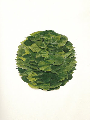
I feel the image below has the same feeling as the bug above, that is made of circles, as all the smaller elements are combined and contained to create a whole image.
These small sections of human anatomy look interesting in this layout as you get to see the whole image (a human body) in its entirety but in a different way to what is normal.


The following images are layouts for posters, which I feel have a simplistic, geometric feel. This simplicity makes the designs stand out and the layouts become the focus.


I thought the image of the umbrellas was interesting as they are made up of complex structures, yet on the outside (the top bit we see) they are simple. I think they also create an interesting pattern.

This image of houses and pylons creates an intricate repeat pattern, due to the wires on the pylons, while using a simple, subdued colour palette. I would like to use the same technique with my imagery for my stationery as I feel the more simple and paired down my colour palette, the more the focus will be on the designs and the materials of the products.






 The design below interested me in relation to structures as the geometric elements in the design relate to book design and layout & grids that are used to help with layout in books. I think the Japanese text adds an extra element of structure as it is quite formal looking, with geometric elements.
 I think the image below is interesting as the structure of the bug is made up of lots of smaller elements (circles) and I like the way the individual elements are contained within its main outline.
 I thought the image below was quite an interesting way to represent structures as it could be interpreted as a vertical structure or a structure from a birds eye view (which it is) I think this kind of floor plan image creates an interesting visual that would look good as a papercut, with all the sections connecting to create a larger image.
 This image was chosen due to its layout. This is a representation of structure within layout, as well as being made up of smaller elements. Each bug is made of small leaves and twigs, giving each of them the feeling of structures as they are a large element made up of smaller elements.
 I feel the image below has the same feeling as the bug above, that is made of circles, as all the smaller elements are combined and contained to create a whole image.
 These small sections of human anatomy look interesting in this layout as you get to see the whole image (a human body) in its entirety but in a different way to what is normal.
 The following images are layouts for posters, which I feel have a simplistic, geometric feel. This simplicity makes the designs stand out and the layouts become the focus.
 I thought the image of the umbrellas was interesting as they are made up of complex structures, yet on the outside (the top bit we see) they are simple. I think they also create an interesting pattern.
 This image of houses and pylons creates an intricate repeat pattern, due to the wires on the pylons, while using a simple, subdued colour palette. I would like to use the same technique with my imagery for my stationery as I feel the more simple and paired down my colour palette, the more the focus will be on the designs and the materials of the products.