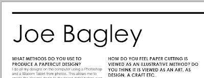
Below are a few initial typography choices of title fonts and body copy fonts. I want to use quite angular fonts or fonts that look quite geometric as I feel these give a papercut type effect with the definite straight lines and full curves. I also think it is importat to use fonts that give a delicate or fragile appearence too as I think this reflects the fragile nature of papercuts.
Alte DIN 1451 Mittelschrift

Baskerville Regular

Gill Sans

Century Gothic

Century Gothic and case experimentation.


